Preparing your Negatives for Conversion
Opening Negative Lab Pro
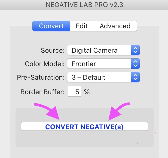
Convert Settings
Editing in Negative Lab Pro
TONE Settings
COLOR Settings
Sharpening
Saving Your Default Settings
Positive Copies
Advanced Options
Workflow Tips and Tricks
Preparing Your Negatives for Conversion
Once your negative scans are inside Lightroom, there are a few simple steps we need to do to prepare them for conversion before we open Negative Lab Pro. The exact steps will be a bit different depending on the type of scan you have.
Be sure to follow the steps for your scanning method.
DIGITAL CAMERA SCANS
-
Before converting, use the white balance selector in LR to sample off the film border (you can do this once per roll and sync across photos). If no film border is available, or if Lightroom says that it is too bright, use ‘Auto WB’ setting in Lightroom.
-
If necessary, crop your negative to exclude any non-film elements (you can re-crop after conversion, or in most cases, you can just use “border buffer”).
VUESCAN/SILVERFAST RAW DNGs
-
Before converting, ensure that the ‘Negative Lab v2.1’ raw profile is available. If you don’t see it available, you’ll need to run ‘File > Plugin-Extras > Update Vuescan/Silverfast DNGs.’ (You can run this on multiple DNGs files at once.) Afterwards, the profile should show “Negative Lab v2.1”. If you get an error, make sure all the profiles are installed from the installation, restart Lightroom, and try again.
-
Use the white balance selector in LR to sample the film border (or ‘Auto WB’ if no film border visible or LR won’t allow you to sample the border).
-
If necessary, crop your negative to exclude any non-film elements (you can re-crop after conversion, or in most cases, you can just use “border buffer”).
TIF SCANS
-
If your scan is at gamma 1.8 or gamma 2.2 (recommended), skip to step 2. If your scan is gamma 1.0, first run the TIF SCAN PREP utility (File > Plugin-Extras > TIF Scan Prep). Then continue with the new TIF it creates.
-
Do NOT white balance in LR. This will create color casts on TIFs.
-
If necessary, adjust your crop or border buffer so any non-film elements are excluded from the analysis.
In a few circumstances, you may get more accurate results by including some film border. If your shot was taken at box speed, or if the scene does not have anything in it that is true black, you will get more accurate colors in your shadows by including a small amount of the film border during conversion. If your conversion looks significantly off, it's easy to try it another way (since everything here is non-destructive). Just "unconvert" and hit "apply". Then change your crop to inlude a small amount amount of border. Reopen Negative Lab Pro, set "border buffer" to 0, and retry the conversion.
You can speed up the pre-conversion process a bit by using Lightroom’s internal “sync” feature to sync the white-balance and crop settings across the negatives, assuming that they are the same film stock. If you have scanned multiple films stocks, be sure to sample the film mask borders separately for each film stock.
Opening Negative Lab Pro
Once your negatives are prepared, select the negative (or group of negative) you want to convert, and open Negative Lab Pro.
On mac, you can open Negative Lab Pro by hitting the CTRL + N shortcut key. Or by going to File -> Plug-in Extras -> Negative Lab Pro.
On windows, go to File -> Plug-in Extras -> Negative Lab Pro to open. Or if you have the Windows Hotkey running (new in v1.2), use the hotkey combo for the nationality you have selected in your Lightroom language preferences:
English: Ctrl - Alt - N
German: Ctrl - Alt - P
Swedish - Ctrl - Alt - N
Netherlands: Alt + N
French: Ctrl + Alt + X
Italian: Alt + Shift + X
Portugese - Alt + X
Spanish - Alt + X
Conversion Settings
Before you begin the conversion process, you have a few options that can help shape your final conversion. This happens BEFORE the conversion process, because Negative Lab Pro needs the data as an input for calculating the conversion itself.
Don’t worry too much about getting it right the first time. You can always experiment later. Just un-convert your negative, try different settings, and re-convert. And since this is all non-destructive, you can also make virtual copies in Lightroom if you want to compare!
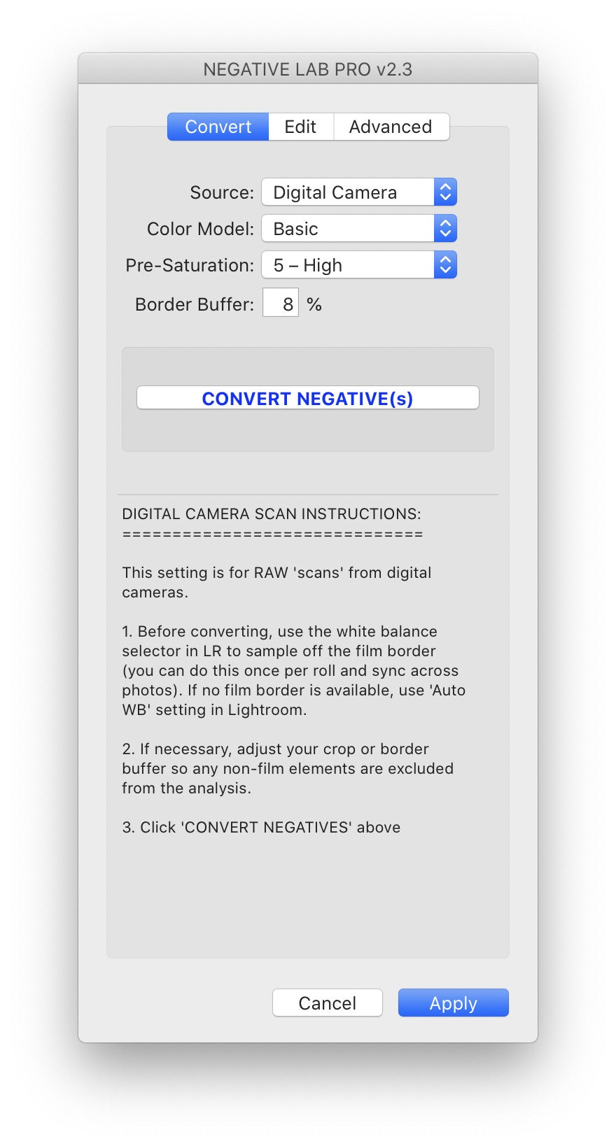
COLOR MODELS
Color Models help get your scans closer to the classic colors that were previously only attainable through pro lab scanners.
Basic
This color model offers a more neutral rendition of colors (for those who do not want to emulate lab scanners and are more interested in color accuracy).
Frontier
Based on Fuji Frontier scanner. This model produces beautiful the teal-blues, golden yellows, and warm tints which are widely associated with film.
Noritsu
This color model is based on the Fuji Noritsu scanner. While it shares many of the qualities of the frontier scanner, it is generally not as warm.
B+W
Whenever you’re working on black and white scan (or you just want to convert a color negative to black and white), you should use this mode.
NONE
This turns off all the settings effected by the color model section, and defaults back to whatever your profile was before opening Negative Lab Pro. This is useful if you want to use your own profile / calibration / color settings, as this will make sure that NLP doesn’t override those existing settings when you open it.
PRE-SATURATION
Pre-saturation is changing the saturation level on the original negative prior to conversion. While this does affect the saturation level of the conversion, it also affects the color separation and hue of those colors.
It is a good idea to start at the default setting (3), and after all your other adjustments, if you find that your image is a bit over- or under-saturated, then un-convert, change your setting, and re-convert.
Lower presaturation values will have following effects:
- Lower color separation, with fewer visible hues
- Slightly warmer color hues
- Less vividness
Higher presaturation values will have the following effects:
- More color separation, with more distinction between hues
- Slightly cooler color hues
- More vividness
BORDER BUFFER
"Border Buffer" lets you skip the whole cropping step during prep. You just specify how much of the edges to ignore during conversion
As mentioned earlier, Negative Lab Pro works by running an analysis on your image. What it includes (and excludes) from the analysis can have a dramatic impact on that analysis.
“Border Buffer” lets you specify the percentage of space around your film you want to exclude from the conversion analysis. It prevents the need in previous versions of Negative Lab Pro to always full crop your image prior to conversion (and then un-crop afterwards if you wanted to show your borders).
So, for instance, if you crop your film so that the film border takes up roughly 5% of the width and height of your cropped area, you could set a “border buffer” larger than 5% to exclude that area from analysis.
Some elements (like film holders, or un-masked direct light from your light source) should always be excluded from the analysis.
The border of your film (i.e. the unexposed area of emulsion surrounding the film negative itself), may help or hurt your conversion, just depending on the circumstances and your desired outcome. Generally you will want to exclude the film border from the analysis, but in low contrast scenes or scenes without a true black point, it can be helpful to include for reference.
Since this is non-destructive, it’s easy to make a virtual copy in Lightroom and experiment both ways to find what works best for a given shot.
Converting Your Negative
Once you’re ready, just hit the big “CONVERT NEGATIVE” button to initiate the conversion.
Behind the scenes, Negative Lab Pro is going over every pixel in your image, separating your image into color channels, calculating color corrections and building the perfect tone curve for your image. It’s also saving the information it analyzes to the metadata of that image, so that Negative Lab Pro can recognize it and make adjustments in the future.
Editing Your Image Using Negative Lab Pro
The editing controls inside of Negative Lab Pro were designed to help you bring out the aesthetic you want from your film in a way that isn’t possible in Lightroom's main controls.
And because Negative Lab Pro is non-destructive, you are always working against the original negative.
This not only gives you an incredible amount of editing latitude, but it also helps you achieve more natural results, because all of your changes are happening at the very foundation (instead of as new layers on top of a bad foundation).
So generally, you will get the best results by doing all your editing inside Negative Lab Pro, but we will also look look at how to make edits using Lightroom’s controls if you’d like, using something called “positive copies.”
Tone Controls
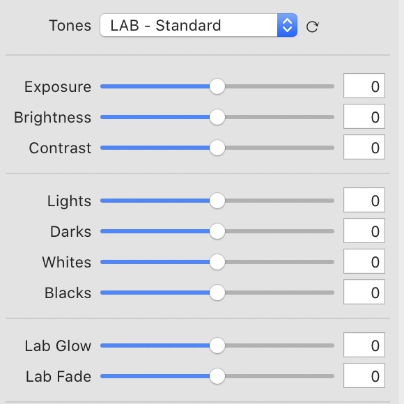
TONE PROFILES
Every photographer approaches film with a different desired look in mind. Tone Profiles help you start a little close to what YOU want.
To some, film photography is represented by the bold “pop” of classic lab scanners. For others, it’s the refined softness of carefully processed Cine film. And for others, still, it’s the flat, “under-processed” look of historic scanning software.
Selecting a tone profile is generally the first step after conversion – it’s the starting point of further tonal edits.
As of NLP v2.2, there are three main “families” of tone profiles, with a few variations within each.
1. CINEMATIC
log // rich // flat
The new Cinematic tone profiles provide great tonal separation in the highlights, and smooth, low-contrast mid-tones and shadows.
Vision3 500T (85B Filter) // Tone Profile: Cinematic Flat // Copyright @a.jamesvisuals_
What it’s doing: These profiles use a logarithmic curve, with the steepest portion of the curve in the highlights, and then it levels out to create that low-contrast look through the rest of the image.
Pairs Great With: Any “Cine film” (like Cinestill, Kodak Vision3, Fuji Eterna). It’s also a great starting point if you like a softer, moodier style.
2. LAB
standard // soft // hard // highlight hard // highlight soft // shadow hard // shadow soft
This is the original series of tone profiles available in Negative Lab Pro. The “LAB-Standard” was modeled after the punchier, higher contrast look of lab scanners
What it’s doing: Similar to a lab scanner, it’s adding auto-toning based on a scene analysis, then mid-tone contrast. It’s also raising blacks and lowering whites just a tad to create some breathing room on each end.
Pairs Great With: I find this works really well with Kodak Portra or Fuji 400H. I just love the added contrast – it gives it that “pop” that you’d expect from a lab scan.
3. LINEAR
gamma // deep // flat
A flat, neutral starting point. Good for editing from “scratch” or replicating the low-contrast default look of home scanning software (EpsonScan, Silverfast, etc).
What it’s doing: At its core, the “linear” profile is just a flat, linear curve between the white point and black point.
Pairs Great With: The “Linear + Gamma” is my go to for all B+W film processing (the gamma is set to mimic traditional black and white photo paper). The “Linear + Deep” is great starting point for working with consumer-grade film that already has higher contrast (like Kodak ColorPlus, Kodak Ektar, Fujicolor, etc). Or, if you want to handle all the tonal adjustments from scratch, this is the place to begin!
FINE-TUNING YOUR TONES
It’s possible to finely control the tonality of your negative in a way that reacts similar to classic lab scanners, all from within Negative Lab Pro.
Exposure (new in v2.3) This adjusts the exposure similarly to how the exposure adjustment works in Lightroom. You will notice the biggest change in the brightest portions of the image first.
Brightness
This adjusts the midtone brightness (or gamma) of the image. The optimal brightness setting can vary greatly based on how the negative was made and digitized, as well as your personal preferences. To add “richness” to your conversion, lower the brightness. To make your conversion feel more “airy”, you might need to add brightness.
Contrast
This is another crucial adjustment. Increasing the contrast will add mid-tone contrast, making the image feel more “punchy” and saturated.
Lights
This adjusts the brightness of the lighter tonal areas. Increasing the number (or moving the slider to the right) will increase the brightness of the light tones in the image. Lowering will remove the brightness of the lighter tones.
Darks
This adjusts the brightness of the darker tonal areas. Decreasing the number (or moving the slider to the left) will decrease the brightness of the dark tones in the image, and vice-versa.
Whites
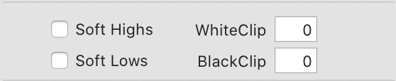
Increasing this will make the white point brighter (with clipping protection, but you still may see some clipping), while decreasing will make the highs feel softer. It’s important to note that lowering the whites will not recover detail (even though you may see the alert go away). To truly recover clipped data, you need to use the “WhiteClip” setting
Blacks
This controls the blackest point of the image, shifting the entire histogram from this point (with clipping protection, but you still may see some clipping). Pushing up on this will create a “soft, faded” look, while decreasing will deepen the image. It’s important to note that increasing blacks will not recover detail (even though you may see the clipping alert go away). To truly recover clipped data, you need to use the “BlackClip” setting
Lab Glow (new in v2.3)
Lab Glow is compressing tonality in the highlights (or if you use a negative value, it is expanding tonality in the highlights). Increasing Lab Glow will the appearance of smoother highlights with less visible detail.
Lab Fade (new in v2.3) Lab Fade is compressing the tonality of the shadows - so you will see smoother shadows with less visible detail and no pure black. And again, using a negative value for Lab Fade will do the opposite - expanding the tonality in the shadows.
CONTROLLING DYNAMIC RANGE
Negative Lab Pro gives you full control over how to interpret the very brightest and darkest parts of your scan, all non-destructively
This is another advantage of a fully-raw, non-destructive process. While the default is set to push the black point and white point to just before clipping, you have full, non-destructive control over this.
WhiteClip, BlackClip This allows you to define precisely how much to clip (or preserve) the pure white and pure black details. By default, Negative Lab Pro (and most lab scanners for that matter) will attempt to get close to clipping without actually clipping (or only clipping a small percentage of pixels). But of course, since this is all processed non-destructively, no details are ever actually lost - they are still there in the negative. For instance, if you find there is white clipping initially after conversion, select the text box and use the down arrow to recover it (or enter a negative number).
Soft Highs, Soft Lows This applies a small amount of “tonal rolloff” to the brightest and darkest tones, which can make them appear softer and more natural. The tradeoff is that you may lose some contrast in the highlights and shadows.
Working with Color
One of the biggest advantages of Negative Lab Pro is how easy it is to get perfect colors out of your film negatives. Negative Lab Pro brings simple, yet powerful tools to your color workflow.
THE 4 COLOR SECTIONS
There are 4 main sections for editing color. They allows you to make nuanced color balance updates to specific tonal regions in your conversion, which is useful when trying to correct color negatives, or trying to match the distinct look of historic lab scanners.
The Main Color Tab – This is the main tab and includes the WB dropdown, the ColorPicker, the Temp/Tint Slider, and the LUT emulations.
Mids – Midtone balance for RGB/CMY
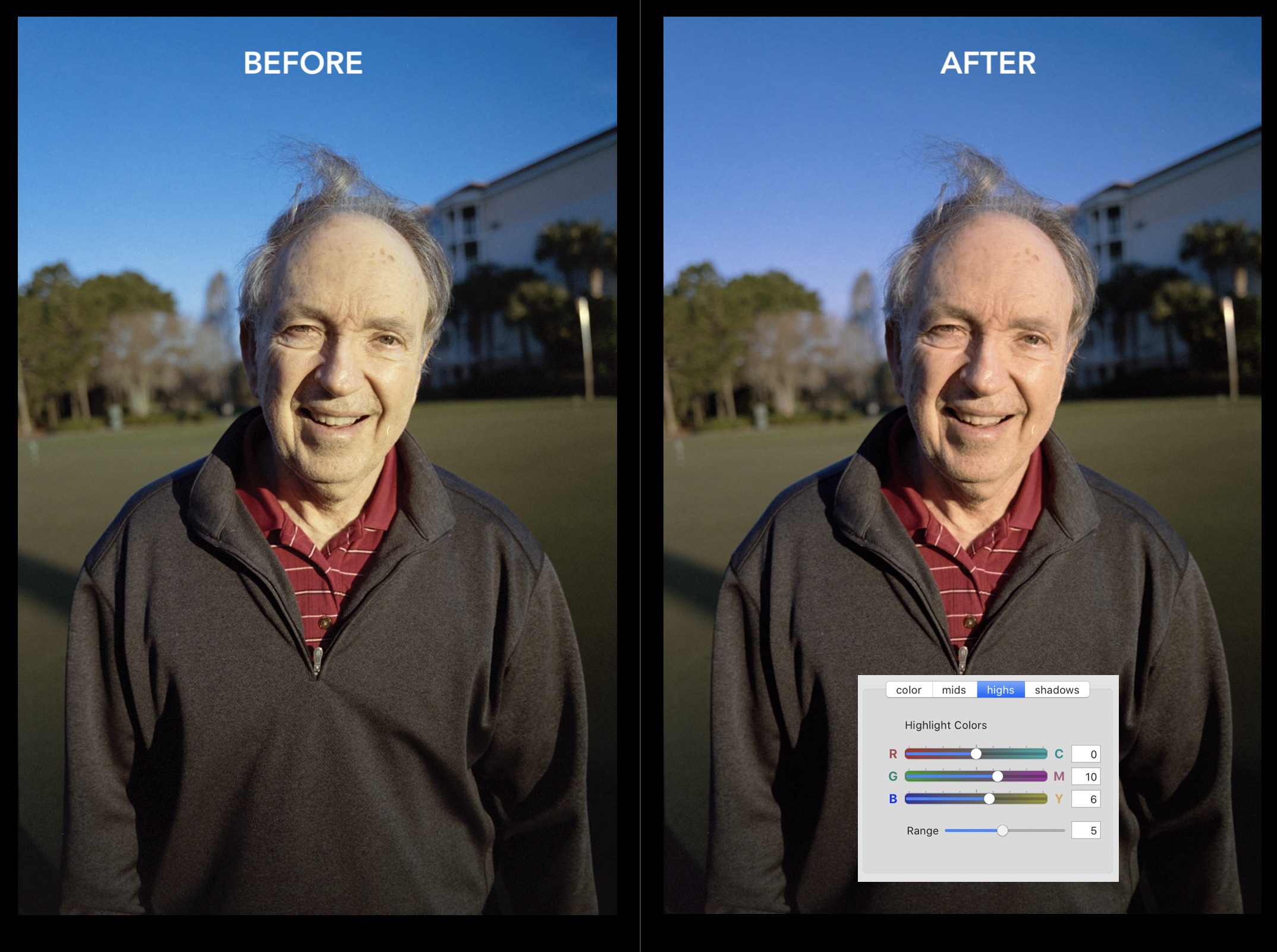
Highs – Highlight Color Toning with Range control
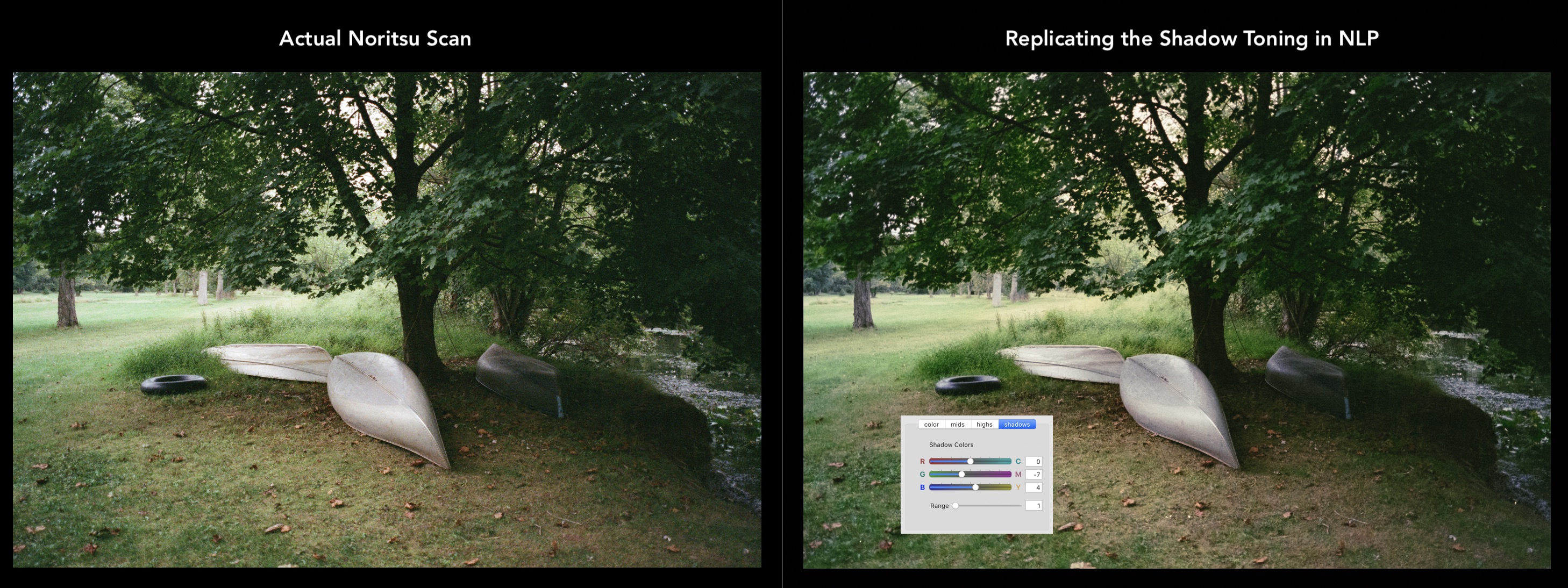
Shadows – Shadow Color Toning with Range control
The 4 panels all work together to get you control over the color balance of your film.
The Main Color Tab
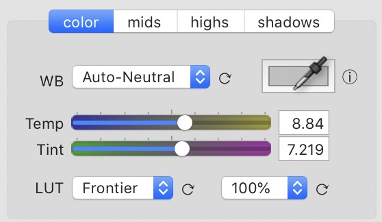
This is where you will probably spend the majority of your time working on color. This panel centers around the integrated Temp/Tint controls.
TEMP/TINT Controls
The centerpiece of color balancing in NLP is the new integrated Temp / Tint sliders. Not only is this an easier, more familiar way to deal with color balance, but now with the new tone engine, it just works beautifully with any tonal adjustments you make.
The sliders here will act similarly to what you’re used to, but with the following advantages:
- The algorithm here has been designed especially for film - to provide more even, natural color adjustments across the full tonal range
- The Temp/Tint settings are integrated with the WB Dropdown, and the ColorPicker controls. So if you update one of those, the values of Temp and Tint will also change accordingly. This makes it easy to fine tune.
Technical Note: While the Temp/Tint sliders will work similarly to how you’re already used to, they are conceptually different in the context of film, and understanding this difference will help you use them better. With typical digital white balancing, you are compensating for the temperature of the light source (for instance, if you are shooting a portrait in overcast light, you may want to warm up the scene to compensate for the cooler light). In the context of film, though, this white balance tool is correcting for 1) the blue color cast caused by the inverted orange mask of film and 2) the assumption of scene neutrality during conversion (i.e. that the brightest part of the scene is white and the darkest part is black). This is why 95% of the time, some level of warmth is needed to be added to film conversions — in other words, having temp and tint set to zero will almost never appear balanced (in fact, if you've used a photoshop plugin previously, that plugin is adding a destructive autocolor layer somewhere during processing, so you really won't even be able to see a "zeroed" temp/tint setting, and future changes you make to the color will be happening on top of this previous, destructive layer, rather than happening foundational to the negative). This also means that with film, counter-intuitively, the warmer the light is in real life when you took the picture, the MORE warmth you will need to add back in (to compensate for the assumption of scene neutrality during conversion). If you have "AutoWarm" or "AutoNeutral" set as your default, a lot of this will happen for you automatically, and you can then adjust to taste.
WHITE BALANCE DROPDOWN
The WB dropdown has a number of automatic and static options for balancing color.
The “auto” options (auto-neutral, auto-warm, auto-cool, auto-avg) are uniquely generated for each negative, based on a multi-layered scene analysis, and is like a more powerful version of Photoshop’s autocolor control.
The “film” options (Standard, Kodak, Fuji, Cine-T, Cine-D) are fixed settings (not scene dependent) based on both film tech sheets and personal experimentation.
- Auto-Neutral - Attempts to find areas in the scene that it thinks should be grey, and then balance them to be grey, similar to Photoshop’s “snap to neutrals” (this is the default).
- Auto-Warm - Focuses specifically on finding and removing blue/cyan casts, creating warmer results than auto-neutral
- Auto-Cool - Focuses specifically on removing any warm tints from the image.
- Auto-AVG - Balances the scene to be an equal amount of all three color channels (previously called AutoColor 1.0). It’s easily thrown off by strong saturated colors or scenes which should feature some colors more prominently than others.
- Standard - A general balance for all film types.
- Kodak - Balanced for Kodak films.
- Fuji - Balanced for Fuji films.
- Cine-T - For Tungsten-balanced cine films.
- Cine-D - For Daylight-balanced cine films.
As of version 2.2, all of these options are connected to the new “Temp/Tint” sliders. So you can use any of above options as a starting point, and then further fine tune.
COLOR PICKER
New in v2.2, you can now use a “color picker” to select a neutral grey area of your scene and have the scene white-balanced to that area.
This can be very useful in some situations, especially if you have a good neutral reference point (like a grey card) in the scene that you can use.
Using the Color Picker is different for Mac vs Windows:
For Mac Users:
- Click the Color Picker icon in Negative Lab Pro. This will make the Mac Color Tool appear.
- Click the Color Picker on the Mac Color Tool. When you do this, you will see your cursor change.
- Move your cursor to the area you want to sample, then click!
- If you want to sample a different point, just repeat steps 2 and 3.
- You will also see the Temp/Tint sliders update. If your color balance is close, it’s usually easiest to adjust from here. If your balance is way off, you can click the “WB” menu title to zero out your white balance.
For Windows Users
- You must have graphics processing turned off (in Preferences > Performance). Sorry, but I don’t think there is a way around that!
- Click and DRAG directly from the color picker to the area on the image you want to sample. You will NOT see your cursor change during this time.
- Release your mouse when you are over the area you want to sample. There may be a slight delay, as it is set to sample in 3-second intervals.
- If you want to try multiple points, just keep holding down your mouse (instead of releasing) and it will sample your current mouse point every three seconds. When you are happy with your color balance, you can release your mouse.
The output from the color picker will show up in the temp/tint slider itself.
As long as you are in the right ballpark, it is usually easier to fine-tune your temp and tint settings using the slider (or the up and down arrow keys while the edit box is selected) than using the color picker again.
MIDS / HIGHS / SHADOW TONING
One of the keys to being able to replicate the effects of lab scanners (or other darkroom processes) is being able to independently control the color balances in different tonal regions.
Using the tool is pretty self explanatory, but it helps to understand the relationship between RGB color and CMY color. In short, the are the inverse of each other.
Red/Cyan - Red is the opposite of Cyan.
Green/Magenta - Green is the opposite of Magenta
Blue/Yellow - Blue is the opposite of Yellow
So, for example, if your image has a Red tint, you can fix that by adding Cyan (because they are complimentary colors, opposite each other on the color wheel.) The same goes with the other color combos. A little experimenting should make these relationships clear.
MidTones
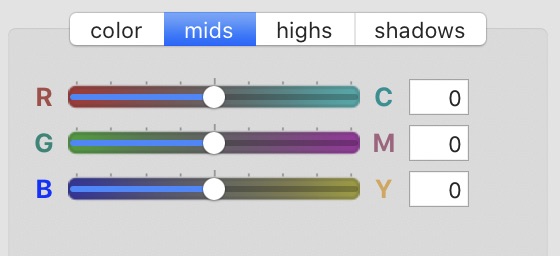
Adjustments made here impact the color balance of the entire image (without affecting the white point or black points of the image).
Highlight and Shadow Color Balancing
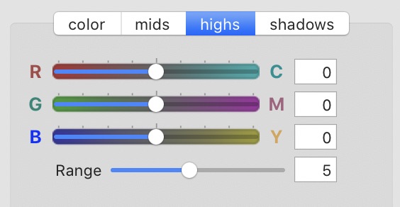
You may find that the shadows or highlights are not color balanced quite right. This can happen when the darkest or brights points of your image are not neutral.
For instance, if you take a picture of a dark green forest, you may find that the darkest point is rendered as black instead of dark green. Or you may find that the brightest parts of a golden sunset are rendered as bright grey instead of bright yellow. Adjusting the highlight or shadow color balance is basically just reseting the color of the brightest and darkest points in your rendered image.
You may also want to adjust the highlights and shadow color balancing for purely creative effects, for instance:
Using Highlight toning to adjust skin tones without effecting the shadow tones.
Using Highlight toning to bring back the natural, bright warmth of sunsets or other warmly lit scenes.
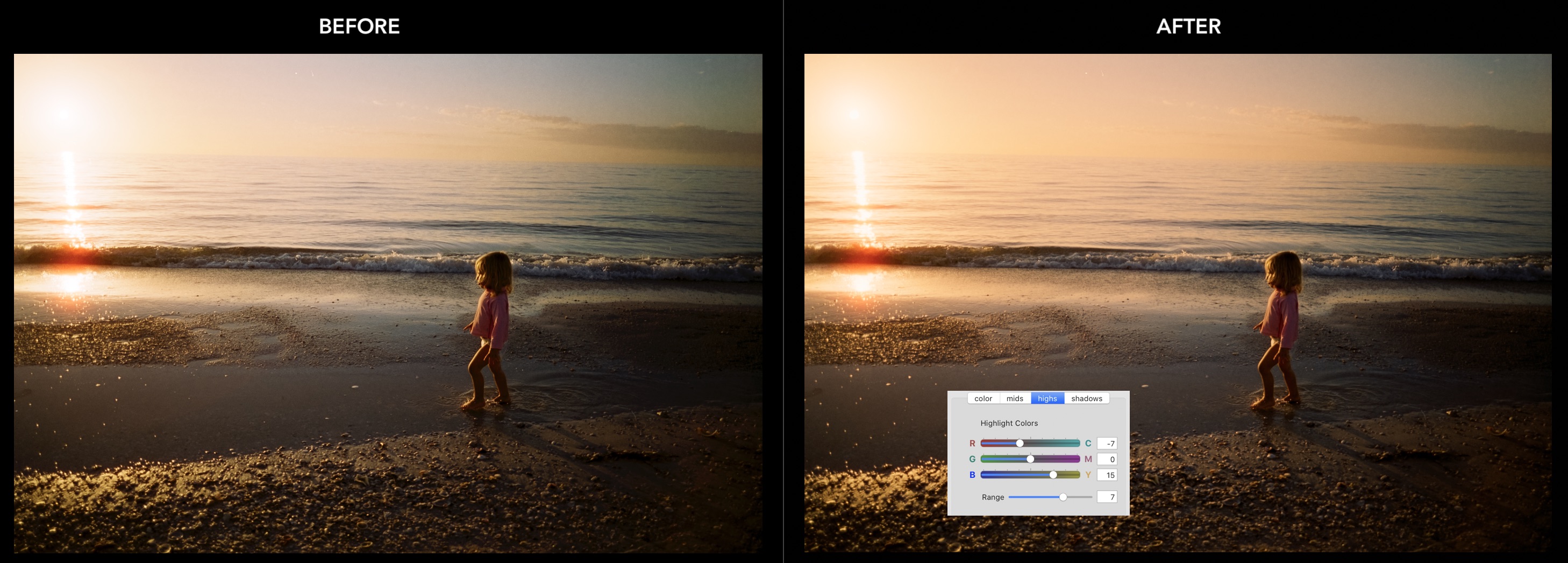
Using Shadow toning to replicate the “beautiful mistakes” of classic lab scanners
LUTs (LR-Classic Only)
3D Lookup Tables (LUTs) enable even more nuanced tones, colors and emulations.
Negative Lab Pro v2.2 introduces 4 new LUTs which are integrated directly into the tool for Lightroom Classic users (sorry, but Lightroom 6 doesn’t have a way to do this)
- Natural - Enhances color accuracy. The most noticeable changes will be truer to life blues, with natural greens and skin tones.
- Frontier - Richer colors with purer neutrals. “Peachier” skin tones. Better separation between greens and yellows. Less cyan skies, less “cherry” reds. My personal favorite.
- Crystal - Rich tonality with lots of depth and more “print-like” subtractive color reproduction. A tendency towards green in shadows. Similar to Fuji Crystal Archive Paper.
- Pakon - Enhanced luminosity with clean contrast. Great separation between colors and neutrals, with dominant bright neutrals. Similar to Pakon F135 scanners.
NOTE: The LUTS will only be visible if you are using Lightroom Classic 8.0 or later AND you have the enhanced profiles installed properly. They should install automatically as a part of the Mac installer package, but follow the instructions in the Windows readme file to add the enhanced profiles required for the LUTs to work.
SHARPENING
Negative Lab Pro includes sharpening profiles based on popular sharpening / noise-reduction schemes.
Sharpen: Leave as Set (new in v2.1) This will leave sharpening at whatever the user or Lightroom has set sharpening at. Essentially, NLP just lets you manage it. This is the new default sharpening.
Sharpen: off All sharpness settings are zeroed out. This is useful sometimes if you are working with scans that had sharpening already applied in their original software.
Sharpen: Lab This produces beautiful, soft sharpening that is brilliant for skin tones and gives subjects an almost 3D appearance, while minimizing noise and grain. Great for portraits, or fine-grain films, like Portra. It is based on the default output of Fuji Frontier lab scanners. The sharpening scheme focuses on edges, with a mask to prevent sharpening unwanted grain or noise.
Sharpen: Scanner This produces gritty, textured sharpening, that accentuates grain and noise, and is popular in lomographic photography circles. Great for street photography, black and white, or anything were you want a gritty vibe.
Saving Your Default Settings
When you first use Negative Lab Pro, there are already a couple of defaults set up. For instance, the Tone Profile is defaulted to “Lab - Standard”, the WB is set to “AutoNeutral” and everything else is zeroed out.
BUT you can make the defaults whatever you’d like! For instance, if you want a warmer, more cinematic look with lots of richness, you can set the tone profile to “Cinematic - Rich” and set the WB to AutoWarm. It’s entirely up to you.
Positive Copies
If you want to make additional adjustments using Lightroom’s regular controls, you'll want to make a "positive copy".
While there are many features in Lightroom that will still work great with your RAW negative, if you want to use Lightroom’s main tonal and color balancing tools, you’ll probably want to make a positive copy. That’s because those main tools will not work as you’d expect in the context of a RAW negative.
Then, on the positive copy, all of Lightroom’s controls will work as you’d expect.
If you can, though, I recommend trying to get as close to your “finished” look using the controls in Negative Lab Pro, rather than always making a positive copy. The reason for this is that the controls in Negative Lab Pro were specifically designed for working with film, and they allow you to work non-destructively on the the original RAW image.
But if you do decide to edit as a positive copy in Lightroom, there are two ways you can make one.
- If you already have Negative Lab Pro open, just select the “Make Copy” Option. Then, once you hit “apply,” it will automatically create positive copies of any images you had open in Negative Lab Pro. You can access more options in the “Advanced” tab for exactly how and where the positive copy will be made.
- If you don’t have Negative Lab Pro open, or you want to make positive copies of lots of images, just select the images you want, then “right-click > export > NLP - Positive TIFF Copy” – this works just the same as the first option, but offers more flexibility.
With this second option, there are lots of ways you can customize it. You can access all the assumptions inside Lightroom’s main export window. Just go to “File > Export” and then on the left-side, select “NLP - Positive Copy - TIFF”. From there, you can change any aspect you’d like (the file name, the sub-folder name, etc) and then save it as a new export preset. From there, you can access it contextually anytime by right-clicking on your image or group of images!
If you have trouble finding your positive copy…
- If your positive copy is stacked with your current image, you will only be able to view it while you are in the folder view that contains those images. For instance, you will not see it if you are on the “Previous Imports” section of the Library.
Advanced Options
The new Advanced Options give you even more control over how your images are processed.
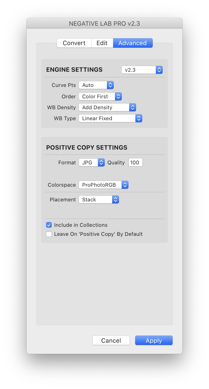
ENGINE SETTINGS (new in v2.3)
The new “Advanced Engine Settings” allows you to fine-tune the way the internal engine is working. This makes it easier to match previous versions of Negative Lab Pro, or find the engine settings that work best for your particular needs. Think of it like “Process Versions” in Lightroom, but with the ability to fine-tune each of the components that go into making a process version.
ENGINE VERSION DROPDOWN
Select from predefined engine configurations. The default is currently v2.3, but you can also access the engines from v2.2 and v2.1 and earlier.
CURVE PNTS
Most of the adjustments in Negative Lab Pro are happening by making specific adjustments to Lightroom’s R/G/B tone curves. The “curve points” option controls the number of points Negative Lab Pro is using when making these adjustments. While a higher number of points can make adjustments more precise, it can impact the smoothness of those adjustments.
- Auto (default) - automatically sets the number of curve points based on the negative. This should result in a good balance of smoothness and precision.
- Smooth - sets 4 control points, which will result in very smooth tonality with responsive adjustments, but limited editing range.
- Precise - sets up to 14 control points, which will allow for lots of editing range, but in some cases, you may start to see visible posterization.
- Manual - allows you to manually set the number of control points anywhere between 2 and 14 points. Note that if you go below 4 points on the curve, some of the editing controls will have no effect.
ORDER
Sets the order of the engine rendering pipeline.
- Colors First (recommended) - calculates color changes first, so that color balance remains stable as you edit tonality.
- Tones First (historic) - calculates tonal changes first, which can cause color balance to shift as you edit tonality. There isn’t really a good reason to do this, other than trying to match the behavior of Negative Lab Pro v2.1 and earlier.
WB DENSITY
This controls the impact of White Balance adjustments on the tonality of your image. (You may not notice any difference here if you do not have a high color balance correction.)
- Add Density - Adding yellow or magenta to the color balance will make the image slightly darker (similar to print).
- Neutral Density - The overall tonality will not be impacted by changes to white balance (easiest for editing).
- Subtract Density - Adding yellow or magenta will make the image slightly brighter (similar to Lightroom’s white balance).
WB TYPE
This sets the algorithm used for how the white balance control is actually working on the tone curve. You may find that some methodologies work better on certain types of films or for certain scenes. (You may not notice any difference here if you do not have a high color balance correction.)
- Linear Fixed (default) - Changes to the white balance are evenly distributed across the full tonal range of the image, with the exception of the black point and white point (which remain fixed).
- Linear Dynamic - Same as above, except it also changes the color balance at the white point and black point.
- Midtone Weighted - Changes to the white balance are most pronounced in the midtones of the image.
- Highlight Weighted - Changes to the white balance are most pronounced in the highlights of the image.
- Shadow Weighted - Changes to the white balance are most pronounced in the shadows of the image.
POSITIVE COPY SETTINGS (new in v2.3)
- Format - Select a TIF or JPG positive copy ouput.
- Bits (TIF only) - Select 16 or 8 bit output.
- Compression (TIF only) - Select lossless ZIP compression to TIF output, or set no compression.
- Quality (JPG only) Set JPG quality between 0-100.
- Colorspace - Select between sRGB (recommended for web output), AdobeRGB (recommended for print output) or ProPhotoRGB (recommended for continued editing in Lightroom, as this is Lightroom’s native color space)
- Placement - Select Stack to place the the positive copy in a stack with the original photo, or Subfolder to place it in a subfolder to the original image.
- Include in Collections - If the original image has already been added to a custom collection in Lightroom, this will also add the positive copy to that collection.
- Leave On ‘Positive Copy’ by default - This will make the creation of positive copies the default whenever you open Negative Lab Pro.
Workflow Tips & Tricks
There are a couple of little “hidden” features of Negative Lab Pro that can speed up your workflow and help in a pinch:
- To reset any individual setting, just single-click on the setting name. For instance, if you want to zero out the “Brightness” slider, just click “Brightness” and it will be reset to zero. (A number of users have suggested a “double-click” on the slider itself, but this isn’t feasible in the SDK)
- Where you see it, click the ⟳ button to cycle through dropdown options. It can be annoying to have to click on the dropdown box again and again to see the different options. It’s much faster to click the ⟳ button and cycle through the options until you find one you want!
- Hover your mouse cursor over most setting names to get more details about that setting. For instance, hover over the “Tones” setting name to see a description for the tone profiles.
- You can get more accuracy over the sliders by clicking the number box beside it, and using the UP and DOWN arrow keys to change it. Holding the SHIFT key while you do this and it will make larger steps
- Once you have an edit box selected, you can use the TAB and SHIFT-TAB shortcuts to jump in between boxes.
- For many of the controls, even if you reach the max of the slider, you can still push it further by directly changing the number in the box. For instance, even though the “Brightness” sider maxes out at 30, you can directly edit the number up to 50.